The University of Michigan has a cool analysis of the election results. Traditionally, the major news organizations show maps like this one:
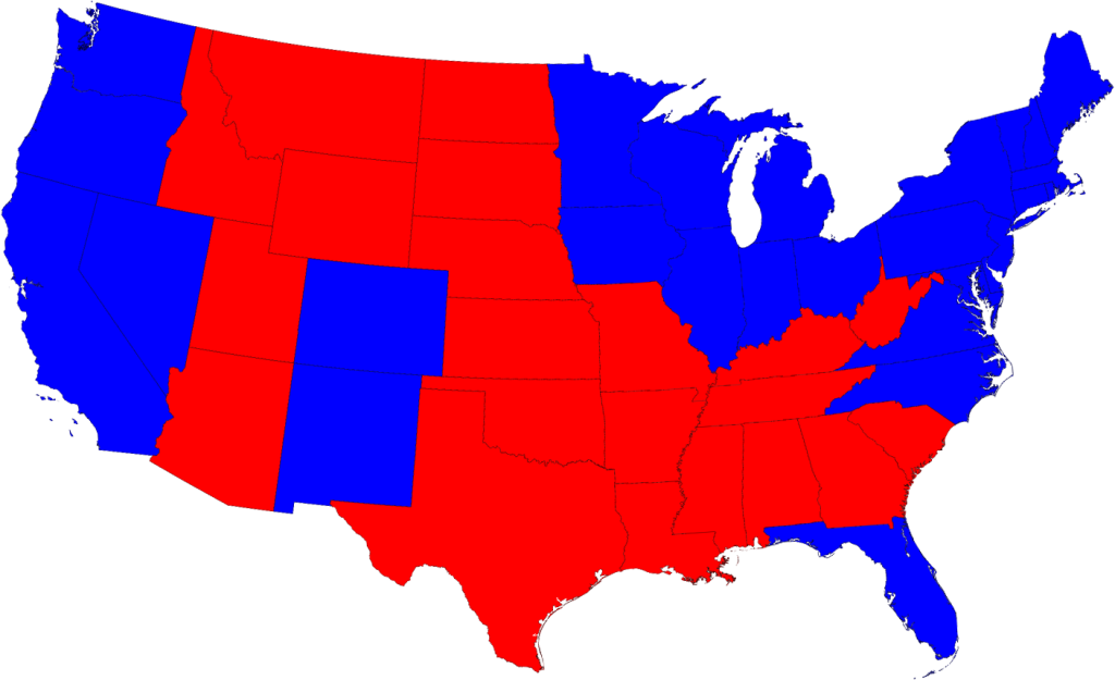
The problem is, this type of representation doesn't factor in population densities, and it is binomial (either red or blue). It makes it look like Obama didn't do very well, especially in the mid-west and south.
So let's see what it would look like if you scaled for population density:
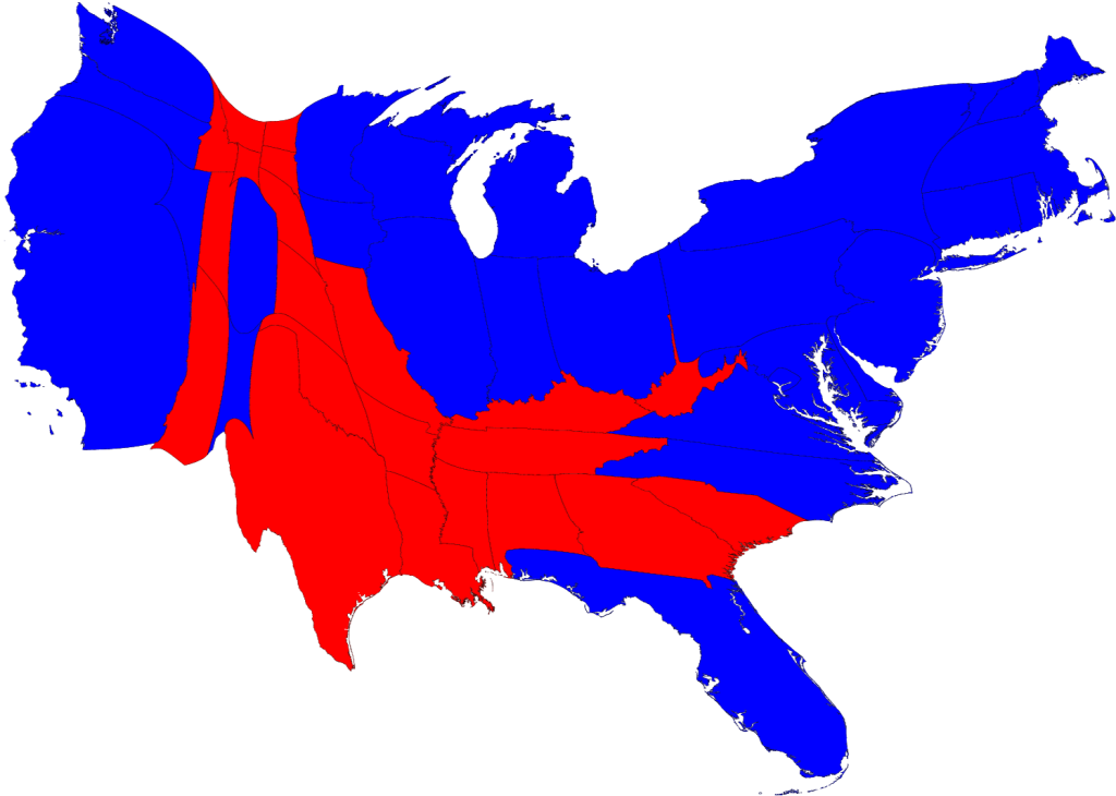
Better, but we still don't see how the counties voted, and the colors are still binomial. If you factor in these variables you get a much more telling (albeit impressionistic) map:
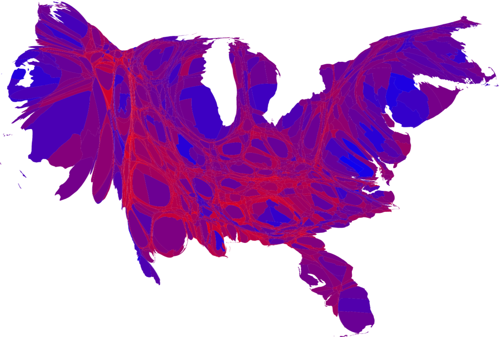
Now we can see a few trends: several large populations that voted almost unanimously for Obama, a majority of the country that was somewhere in the middle, and only some focal regions that were overwhelming in support of McCain.
You can see all their maps, and a discussion, here.
A professor at Princeton put together an animation of the country and how we've voted over time, but it doesn't yet include the 2008 results.


No comments:
Post a Comment